Back to blog frontpage

Evaluating the writing of microcopy in Estonian with neuro-UX
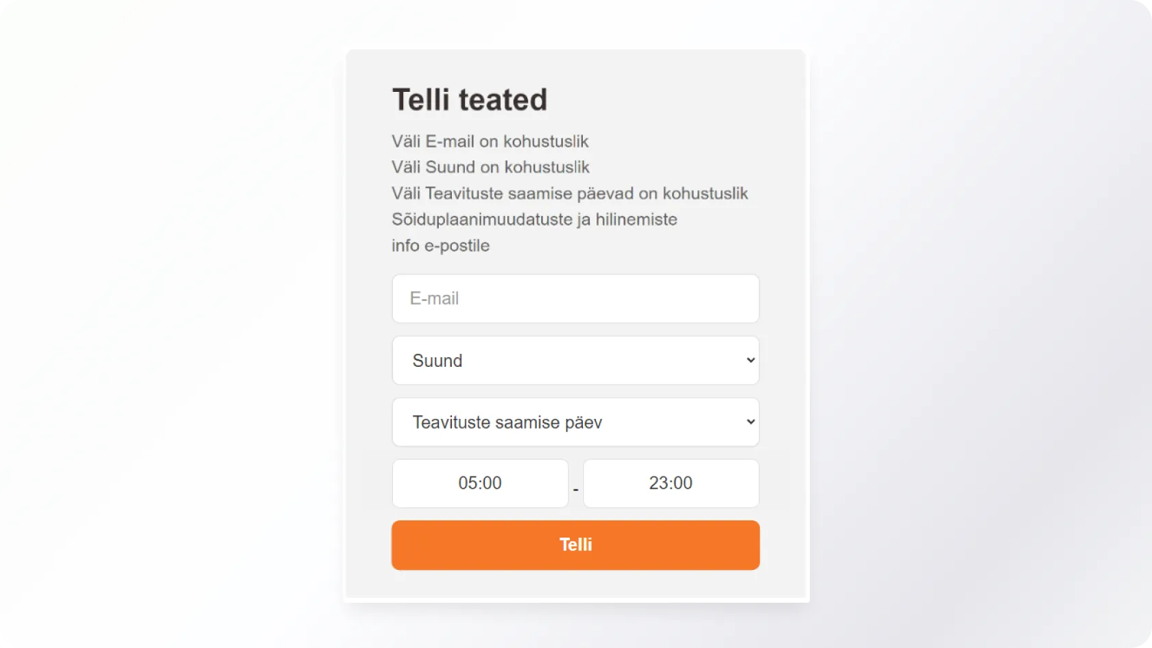
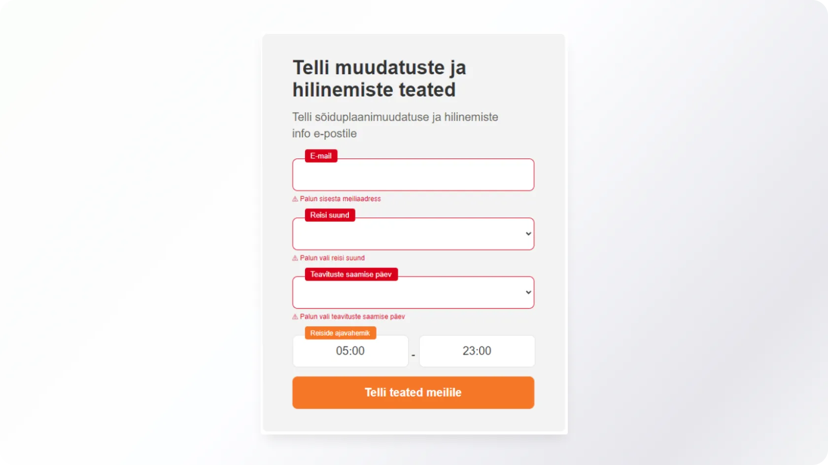
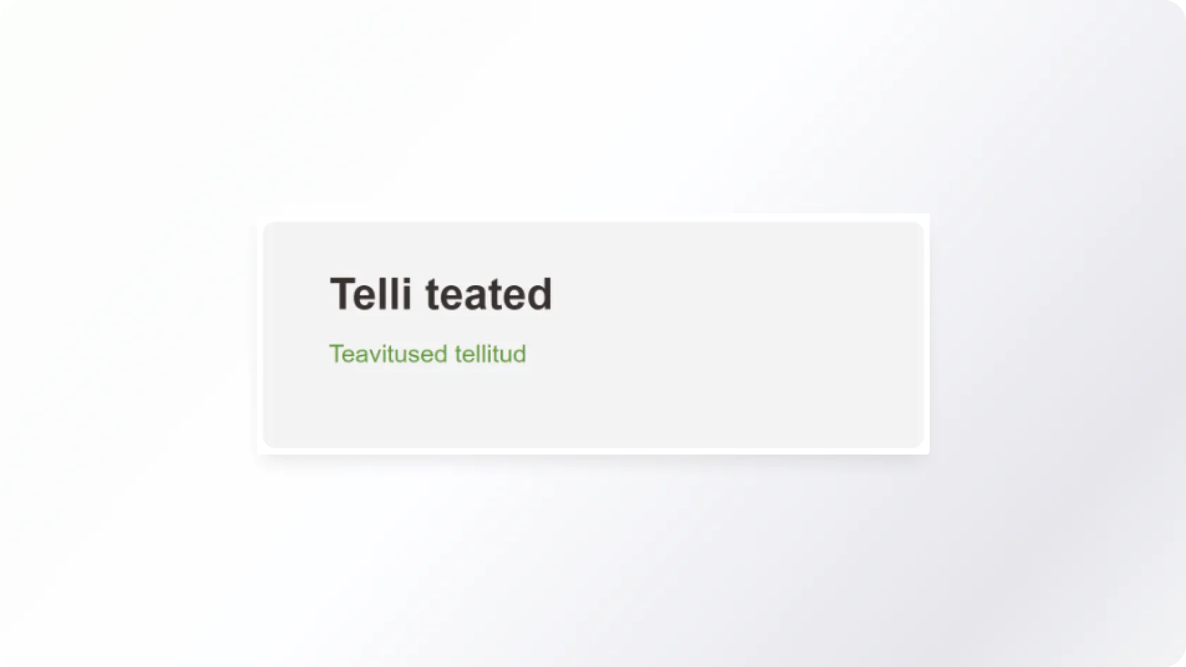
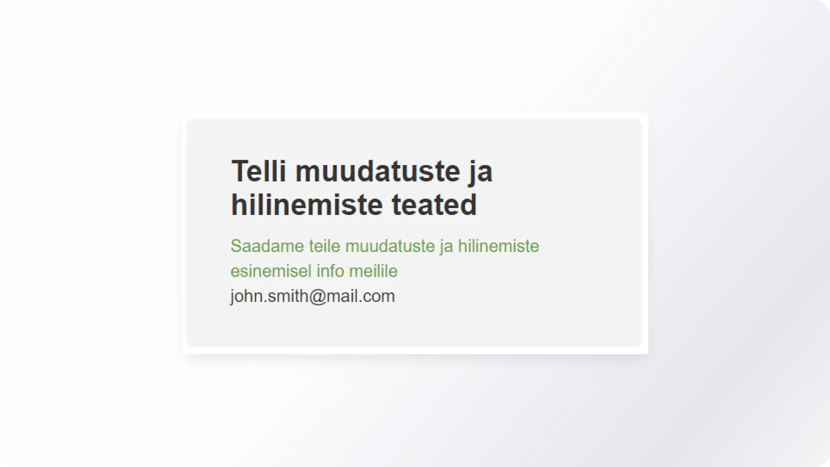
We all come into contact with different user interfaces (e.g. through the web, self-service, ticket purchase systems or other similar services). In most cases, the user interface contains a large amount of microcopy. In this article, I will discuss the importance of microcopy and describe the results of an exciting experiment that I conducted using the neuro UX tool.