On the feasibility of automating design and development – our lessons from building the Veera design system
The Veera (short for web framework in Estonian) design system is a framework intended for constructing national e-services.
- A library of Figma components for designers;
- Libraries of HTML and CSS components for developers;
- Documentation and guidelines for everyone using these components.
In 2023, Trinidad Wiseman and the State Information Systems Agency completed a new version of Veera.
At Trinidad Wiseman, we offer a comprehensive design system development service. We identify your needs, create a Figma-based UI kit, and develop front-end components with clear documentation.
The History of the Veera Design System
The Veera design system was launched in 2018. Its first version was based on the newly completed style guide of the Tax and Customs Board's e-services (designed by Velvet). The initiative for this e-services design system came from the Information System Authority of Estonia (Riigi Infosüsteemi Amet), with the goal of:
- Minimizing the time and cost of creating user interfaces for national services;
- Offering citizens a uniform and high-quality user experience across all e-services;
- Compiling best practices and solutions for widespread use.
The first version of the Veera design system was little more than a requirement to use a system that did not yet exist. Available resources included PDF versions of the style guide, live versions of the Tax and Customs Board services and designs for the planned version of the eesti.ee site.
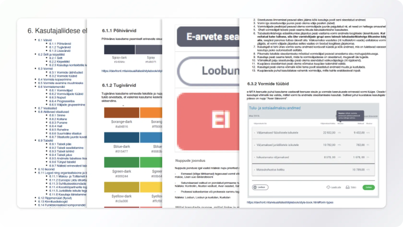
The first version of Veera was based on the e-Tax Board and existed only in PDF form.
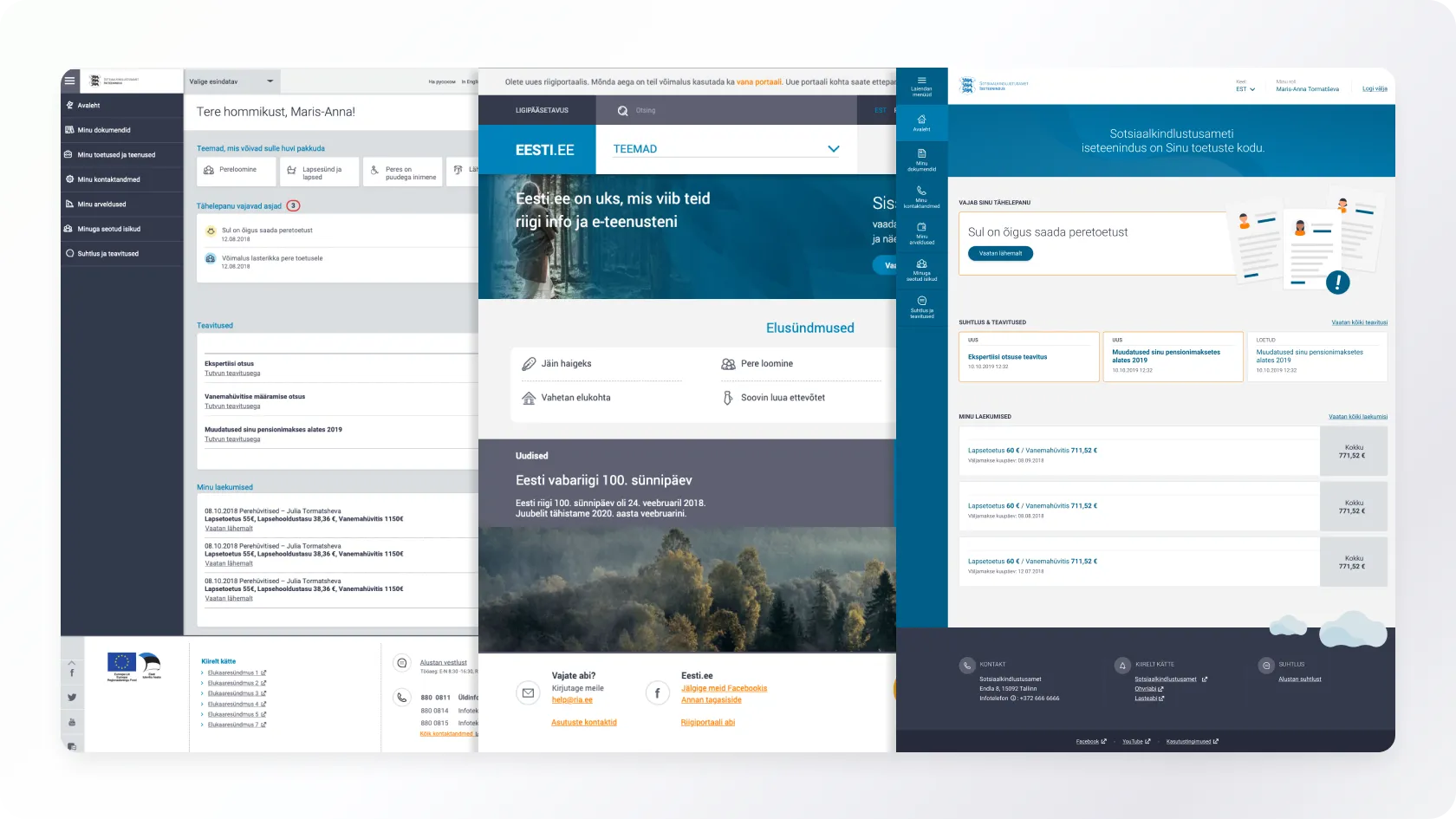
On the left, initial attempts to apply e-Tax Board styles in SKAIS, in the middle, the eesti. ee portal that emerged at the end of 2018, and on the right, the SKAIS design that finally reached the public.
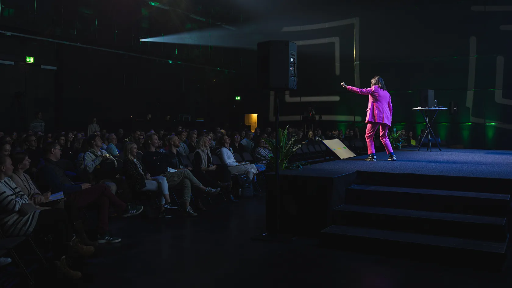
Trinidad Wiseman first encountered the requirement to use Veera in the SKAIS2 self-service project. As a result of several iterations, we transitioned from the gray styles of the e-Tax Board to a blue solution, which remains in use to this day.
In 2020, the pre-alpha version of Veera was released, containing a Figma component library for designers and web-based documentation, along with code components of varying maturity.
Issues with the Existing System
Typically for a pre-alpha version, many parts of the design system were incomplete, technically outdated, or undocumented. Every project that required the use of Veera meant the project team had to create the necessary tools themselves. This led to repeatedly solving the same problems.
Version 1.0.0
The project started in the summer of 2023 with the goal of completing the work begun with the pre-alpha version and formalize it properly. Based on our experience using Veera, we knew it was wise to focus our energy and resources on refining the existing solution - evolution, not revolution, as the foundation was solid.
Hence, the project was named Veera 1.0.0.
Combining the client's expectations with our experience in similar projects, we set 7 main goals for the project:
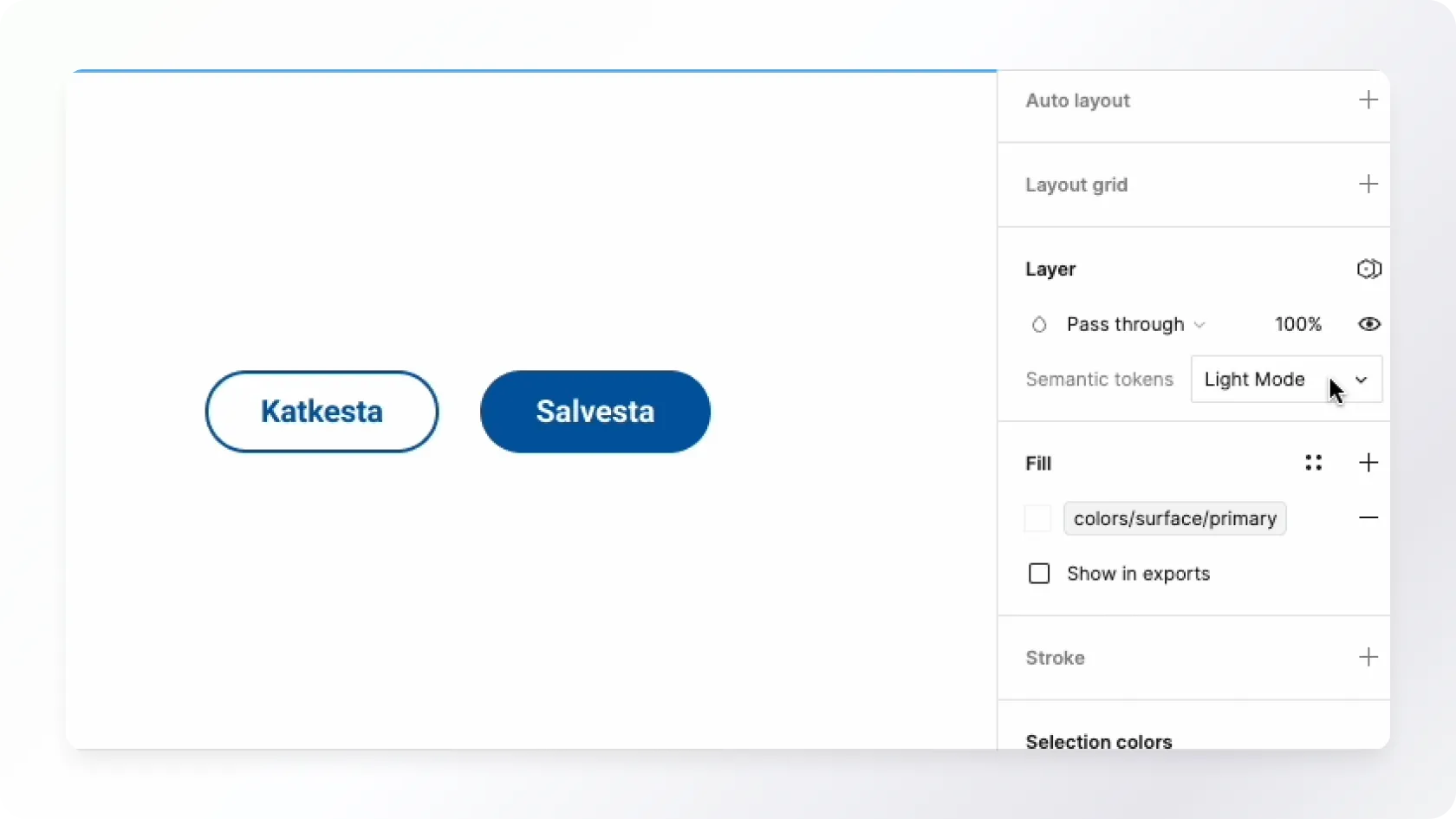
- Save designers' time and effort by providing ready-to-use components built using Figma's best practices and technical capabilities;
- Create a well-thought-out dark mode colour solution;
- Support developers by providing ready-to-use HTML and CSS components compatible with any front-end framework;
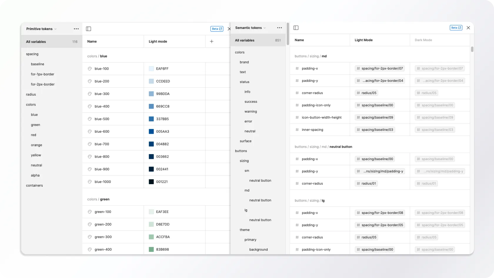
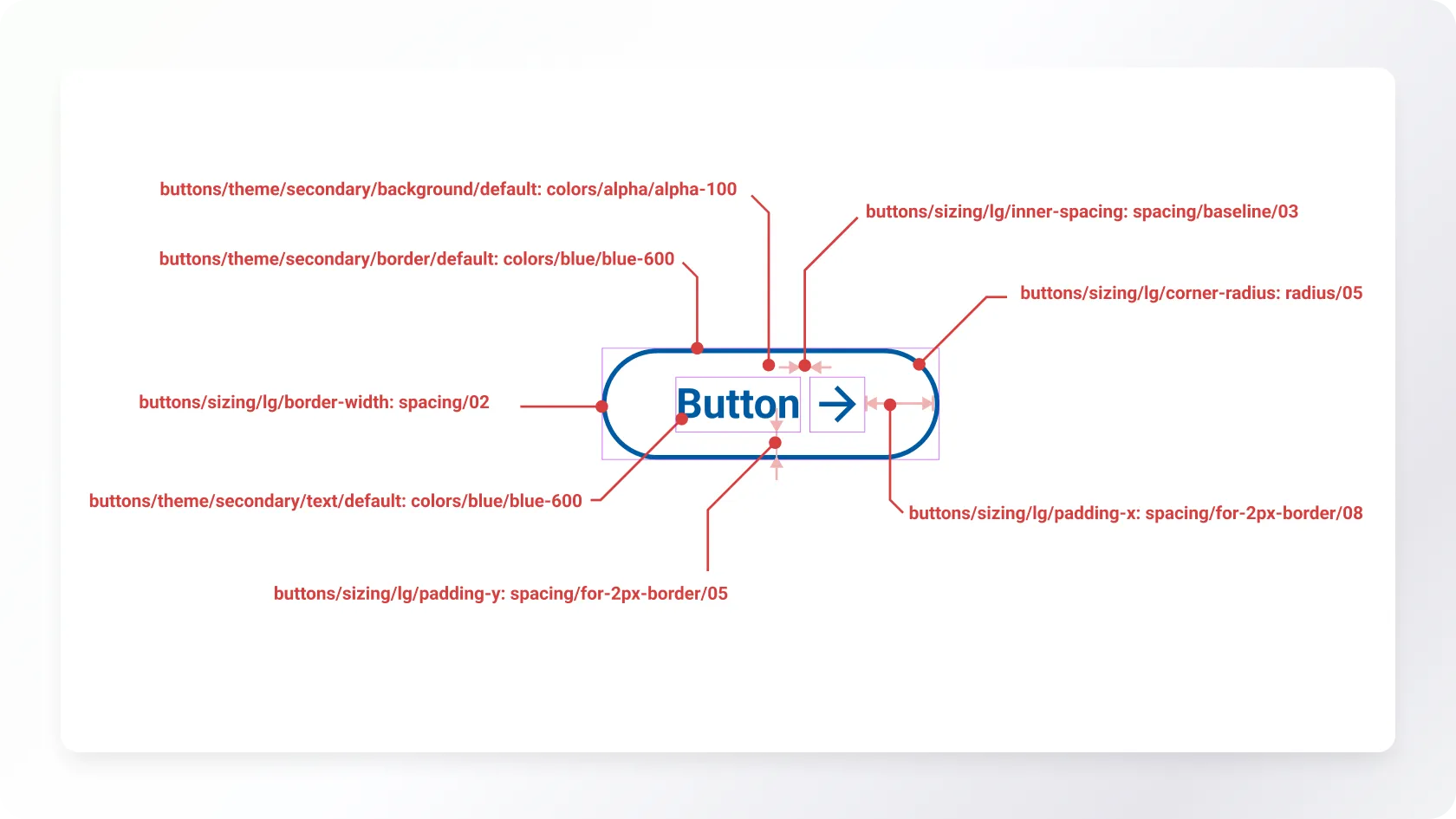
- Automate design to development hand off as much as possible, utilizing Figma Design Tokens (we discuss these more in the Design Components section);
- Support the accessibility of national e-services for users with special needs by building accessibility as much as possible into the components;
- Support user-friendly content and microcopy creation by compiling thorough content creation guidelines;
- Thoroughly document all components, workflows, and instructions.
- With these goals set, we got to work.
Current State Mapping
We conducted a component inventory to better understand how Veera has been used so far. We examined projects where Veera had been applied, compiled, and cataloged examples and variations of different components. This material helped us make decisions and answer the following questions:
- In what sizes should we offer the components? We decided to support three sizes (small, medium, large), which we used for buttons and form fields, for example;
- Which components should we support? If multiple projects had used components absent from the pre-alpha version of Veera, we included them in the 1.0.0 version's component list.
Veera is intended for building public sector e-services, which are obliged to ensure accessibility. An accessible digital environment can be used by as many people as possible, including those with special needs using assistive technologies.
We analyzed the compliance of the components in the Veera pre-alpha version with web accessibility requirements. Based on the shortcomings found, we formulated tasks that were solved within the framework of updating the components.
We interviewed current and future users of Veera to better understand the shortcomings of the existing solution and map expectations for the new version. The interviews did not yield major surprises. They confirmed that the main issues with Veera were competing versions, outdated technical solutions, inadequate documentation, and a lack of a management model. This gave us the confidence to proceed and tackle the solution.
Design Components
Veera offers Figma components for designers. Figma is a leading tool in the industry for user interface design.
Despite Figma's exemplary feature set, we faced a significant question at the start of the project: how exactly to solve the creation and use of Design Tokens in Veera?