How to recognise good user interface design: guidelines for product owners
Good design is much more than just an aesthetically pleasing appearance. A good design is characterised by user-centrism, functionality, and intuitiveness, creating a meaningful and enjoyable experience that supports users' goals and simplifies their daily lives.
Measuring design quality may seem like a subjective task. By following certain principles and nuances, it is possible to help ensure that the resulting product meets the expectations of many users.
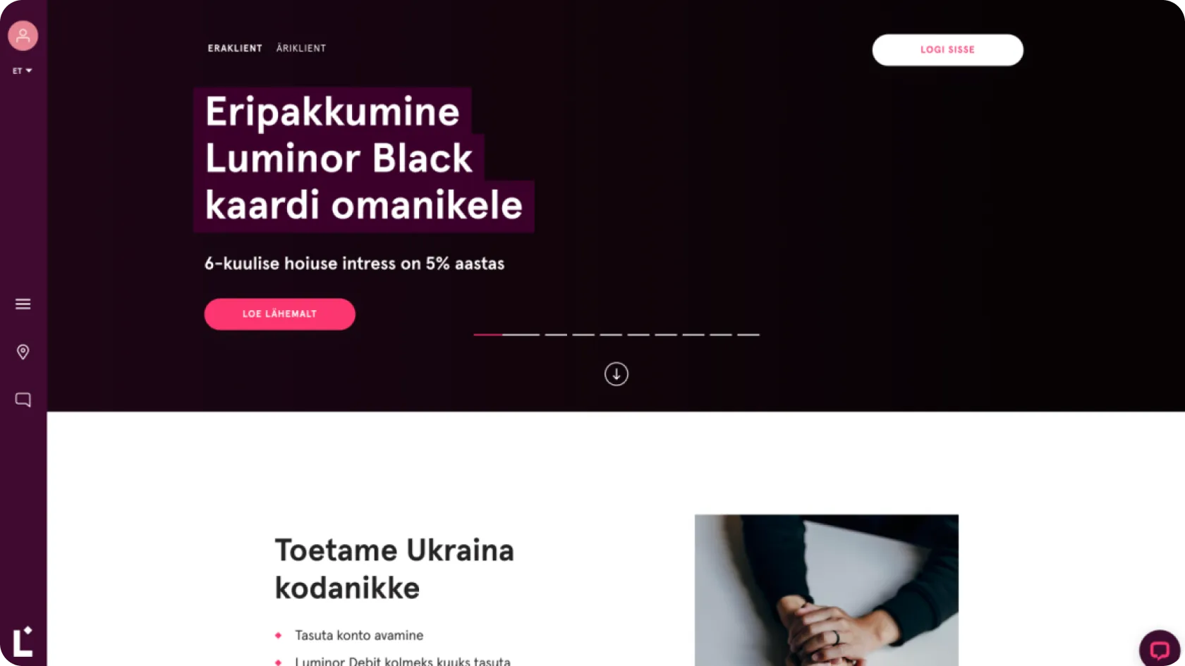
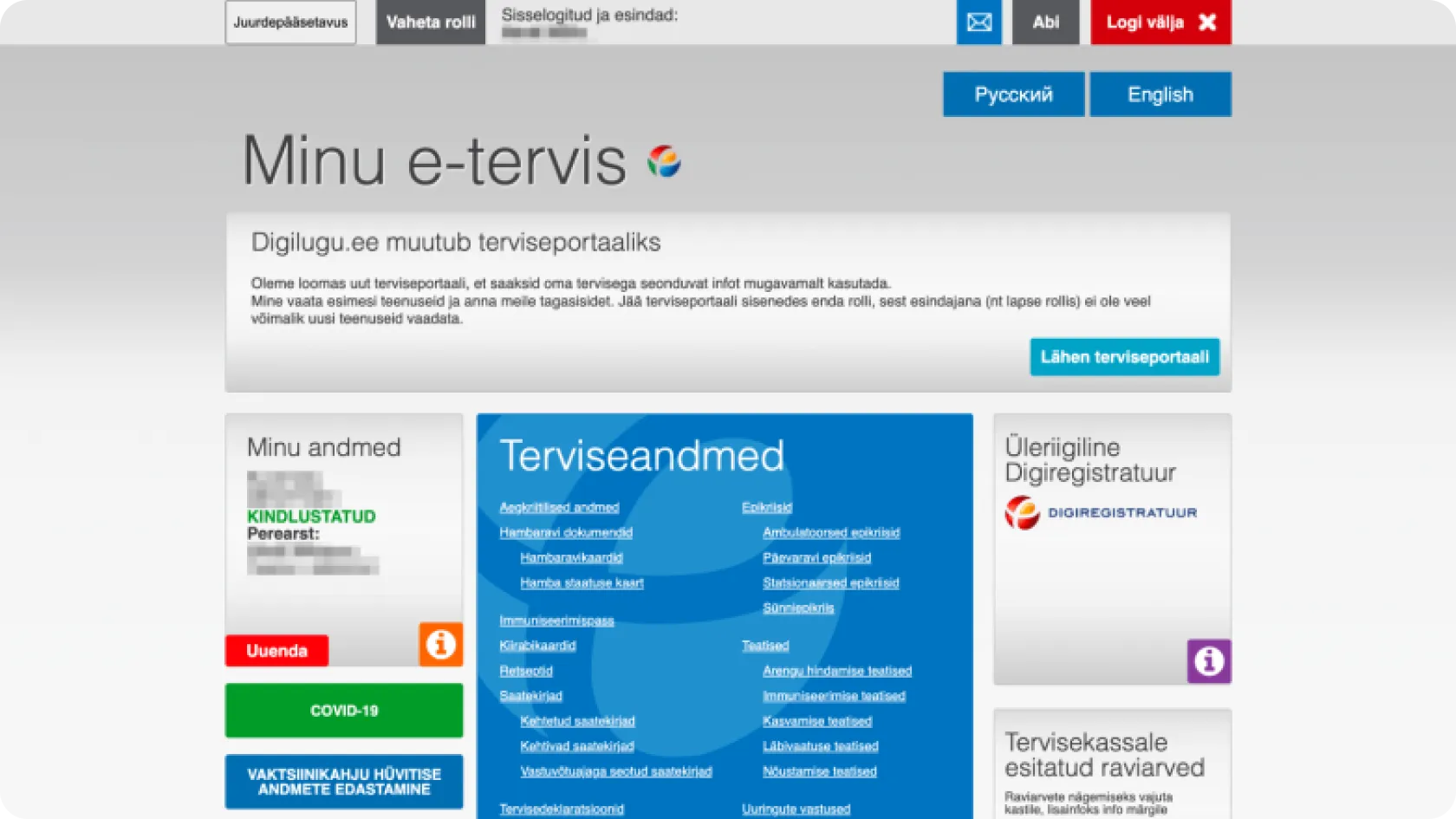
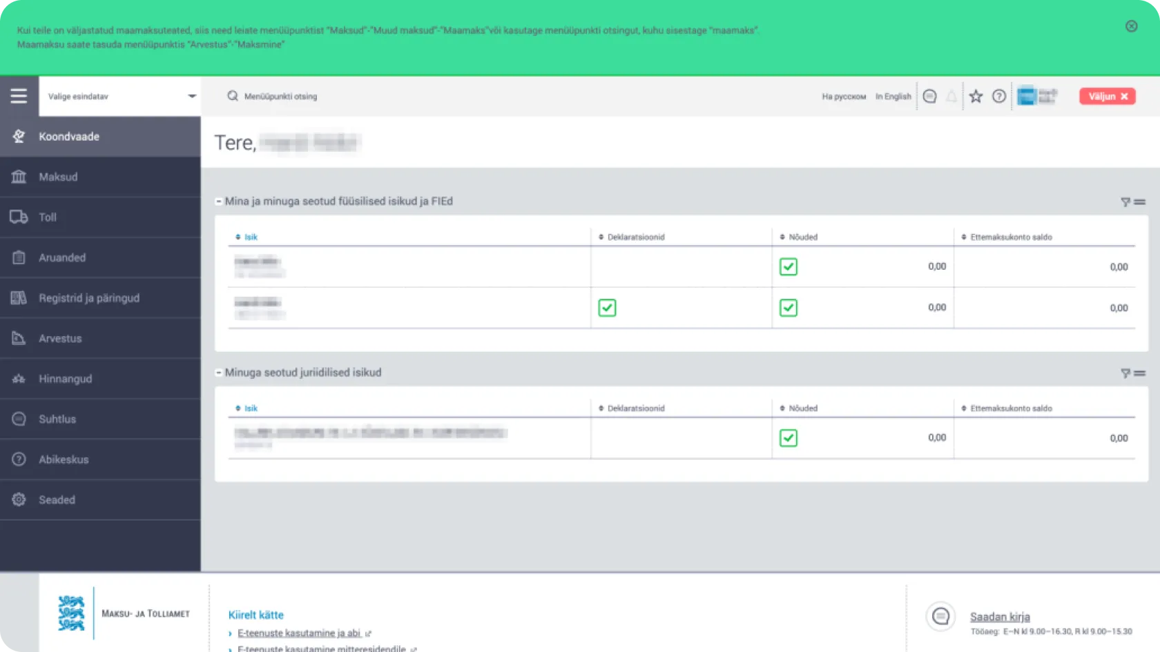
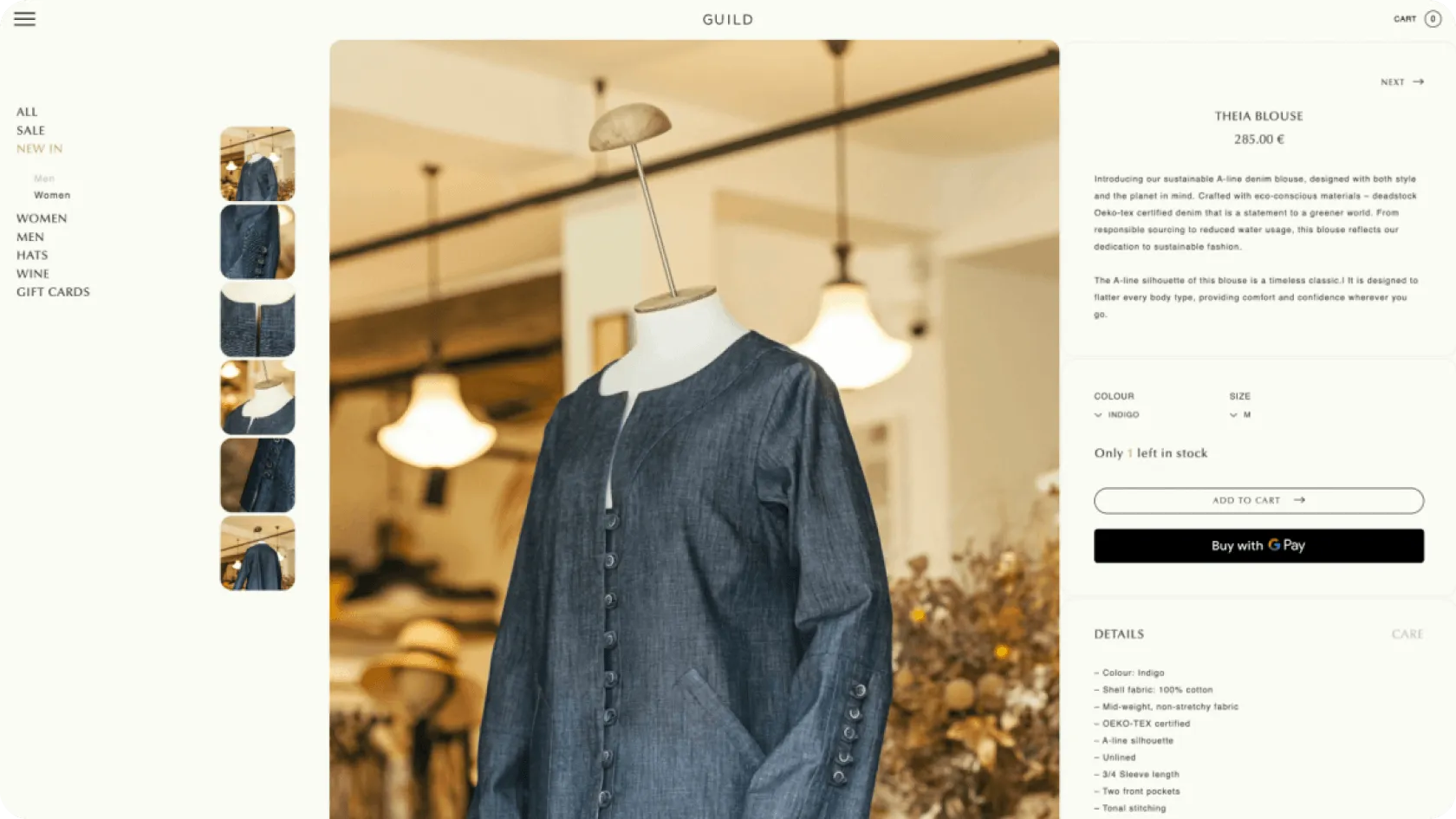
This article will discuss the principles of good design in more detail and look at the design solutions used in various web environments - such as the Tax and Customs Board, Luminor, Sportland, and other web environments likely already familiar to you. Our designers provide recommendations and explanations alongside examples, detailing which aspects should be critically reviewed.
User Experience Needs Hierarchy
This is a model that helps understand and prioritise the different aspects that affect the user experience with digital products or services. Aaron Walter describes this concept, which grew out of Maslow's hierarchy of needs, in his book "Designing for Emotion".
He explains how products and services should first meet the user's basic needs and then offer rich and emotionally engaging experiences. According to Maslow's theory, human needs are organised into a hierarchical system, ranging from basic physiological needs to self-actualisation.
In the context of user experience, the hierarchy begins with functionality, ensuring that the product or service is reliable and meets the user's basic needs. Then, the focus shifts to the product's ease of use and reliability. The ultimate goal is to provide users with positive emotional experiences that enrich their daily lives, arising through a strong connection and loyalty to the product or service.
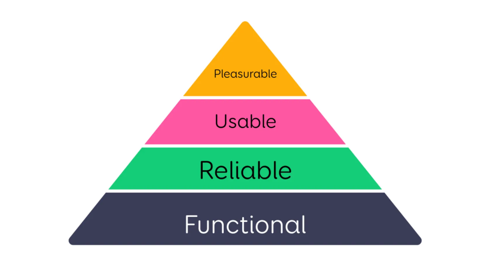
Figure 1 - User Experience Needs Hierarchy
- Functional: The foundational level of the hierarchy emphasises the necessity of the product or service for the user. For people to want to use a product or service, it must solve a problem for them or provide significant added value. The product or service must be clearly useful to ensure its practical applicability in users' everyday lives.
- Reliable: The next layer in the hierarchy highlights the reliability and stability of the product or service. Reliability ensures that users can depend on the product or service at any time and in any situation without worrying about performance issues or interruptions.
- Usable: This level focuses on how comfortable and easy it is to use the product or service. A usable design is intuitive and straightforward, reducing the user's cognitive load and enabling them to achieve their goals quickly and effortlessly.
- Pleasurable: The highest hierarchy level concerns the user's emotional response to the product or service. Design that can evoke positive emotions, such as joy, surprise, or even love, creates a strong emotional bond between the user and the product. Such a design exceeds expectations, enriching the user's experience and promoting brand loyalty.
Understanding these needs and the hierarchy is essential for creating a successful digital product or service. It's important to note that each level builds on the previous one, meaning that usefulness and reliability are prerequisites for convenience and enjoyment.
The Importance of Usefulness and Usability in Design
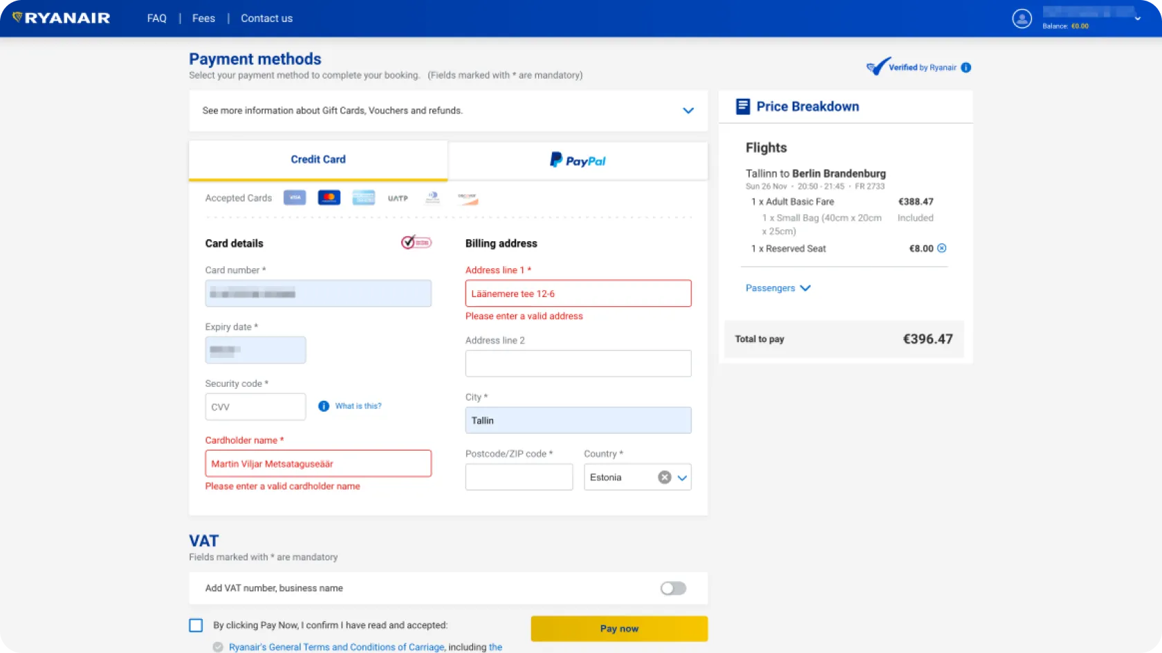
Prioritising purely aesthetic design while ignoring the basic needs of usability results in a product that users quickly abandon. A visually appealing solution might initially attract users, but their interest quickly turns to frustration if the product doesn't simplify their daily tasks. The practical value of a product is as important as its visual appeal.
User-centred design principles start from the user's needs, thereby reducing cognitive load and ensuring intuitive navigation with clear feedback. Considering functionality and usability ensures smooth and effortless interaction with the product or service, which in turn leads to a positive user experience, increases user engagement, and helps achieve business goals.
Based on the foregoing, we have compiled a user interface design checklist, or 7 criteria, to help you assess the design. Next to each criterion, we provide specific examples and lesson(s) on how design can fail if these principles are ignored.
The User Interface Design Checklist